Contents
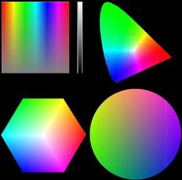 Color properties can be named and arranged in many different ways. The CIE diagram and color circles (right panels) are perhaps the most common but when trying for a Gestalt of normal and abnormal color vision, the top left panel has some advantages. It will be called a color square in the following. Readers familiar with the Microsoft Paint software will recognize this panel, with hues represented horizontally and saturation represented vertically. The narrow scale to the right represents the third dimension, the lightness. Hue and saturation go a long way to illuminate basic characteristics of normal and abnormal color vision. Additional characteristics are needed to define the pigment-based colors that are used in clinical settings, as well as the sources of illumination. These additional properties will be largely left aside in this brief overview.
 and congenital red-green dyschromats (bottom)") Generally, congenital color vision defects are much better understood than their acquired counterparts. An important exception concerns the way people with congenital defects may perceive their deficits: in contrast to people with acquired defects, they have no normal, trichromatic standard to compare with. Therefore, descriptions of what the congenitally color deficient world looks like are hard to come by. It is not all gray and dreary, however. Actually, congenital dyschromats may perform better than normal subjects in some types of color tasks. A good example comes from the military world, where a specific type of congenital red-green deficiency confers a distinct advantage in recognizing the changes in foliage coloration that occur where troups recently have passed through.
Generally, congenital color vision defects are much better understood than their acquired counterparts. An important exception concerns the way people with congenital defects may perceive their deficits: in contrast to people with acquired defects, they have no normal, trichromatic standard to compare with. Therefore, descriptions of what the congenitally color deficient world looks like are hard to come by. It is not all gray and dreary, however. Actually, congenital dyschromats may perform better than normal subjects in some types of color tasks. A good example comes from the military world, where a specific type of congenital red-green deficiency confers a distinct advantage in recognizing the changes in foliage coloration that occur where troups recently have passed through.
 Obviously, subjects with
congenital red-green dyschromatopsia should tend to confuse color samples taken from regions with poor apparent saturation. The confusion effect is particularly striking when changing to a color circle model and asking the subject
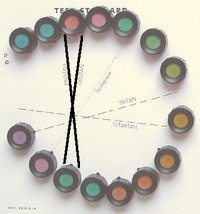
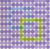
to place color samples in a nearest-neighbor fashion according to perceived hue. The samples should differ in hue only, saturation and lightness being kept constant. This is the format of the Farnsworth D-15 sorting test (right panel). Normal subjects will produce the expected color circle whereas congenital dyschromats will show confusions along well-defined diameters (solid black lines). As can be seen from the D-15 chart, the "circle" is not really a circle but an ellipsoid. The shape goes back to loci with equal saturation in the CIE chart shown above.
Obviously, subjects with
congenital red-green dyschromatopsia should tend to confuse color samples taken from regions with poor apparent saturation. The confusion effect is particularly striking when changing to a color circle model and asking the subject
to place color samples in a nearest-neighbor fashion according to perceived hue. The samples should differ in hue only, saturation and lightness being kept constant. This is the format of the Farnsworth D-15 sorting test (right panel). Normal subjects will produce the expected color circle whereas congenital dyschromats will show confusions along well-defined diameters (solid black lines). As can be seen from the D-15 chart, the "circle" is not really a circle but an ellipsoid. The shape goes back to loci with equal saturation in the CIE chart shown above.
 Confusion also forms the the basis for various types of pseudo-isochromatic test charts, for example, the well-known Ishihara set. The pseudo-isochromatic chart shown to the right is more rarely encountered: it is the Farnsworth Tritan Plate, devised for diagnosing blue-yellow deficits. The pseudo-isochromatic term refers to the fact that the charts look more or less uniformly colored to congenital dyschromats. Most charts use one and the same saturation level and do not allow quantification of the deficit. A notable exception is the Hardy-Rand-Rittler test. The original version has been very popular but color renditions have been found faulty in at least one later edition.
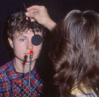 To subjects affected by acquired color vision defects, the most striking aspects seem to be brightness and saturation deficits that give colors unaccustomed, washed-out appearances. There may also occur apparent changes in hue. For example, an object known to be red may appear to have changed its color to orange or to pale yellow, depending on the severity of the deficit. Such subjective changes can often be brought out quite clearly with simple test targets, particularly when presenting the target alternatingly to the left and right eye, as exemplified in the image to the right. Incidentally, subjects who know that they have congenital dyschromatopsia often state that they cannot do these types of tests because they are "color blind". The reasoning is false: acquired defects can very well be superposed on congenital defects and can also produce an asymmetry of color appearance between the eyes.
The new browser-based color tests presented here utilize the Hue-Saturation-Lighness (HSL) color model [1] and aim to assess just noticable differences along the hue, saturation, and lightness (aka brightness) axes:
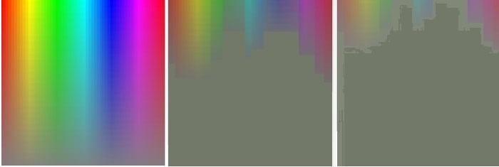
As mentioned above, acquired defects of color vision are widely spread over the color spectrum. Unfortunately, the spread is difficult to illustrate graphically. The following color square approach must be taken as no more than a highly schematic representation of differences between a normal subject (left panel) and two subjects with different degrees of optic neuropathy. The same type of representation of congenital dyschromatopsia is shown above.
Real-life illustrations of self-perceived acquired dyschromatopsia are very rare. The example shown below was produced by an artist suffering from a unilateral macular condition. The left painting shows a scene as seen by the normal eye. The right painting depicts defective vision in the affected eye. Note extensive color deviations (but disregard the dysmetroptic deformation [B,
C]). These color deviations appear to be dominated by reductions in saturation and lightness. Some support for this interpretation can be obtained by applying image-processing software to the normal image: reduction of saturation and lightness along HSL axes results in a fairly close match with the abnormal image.
, 1983 (cover image)")
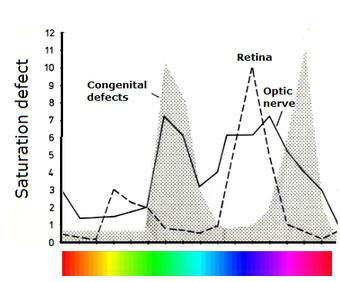
 For comprehensive illuminations of acquired color vision deficits there are no alternatives to time-consuming formal testing. For best results, formal tests for acquired dyschromatopsia should either broadly cover the full color spectrum or concentrate on the bluish-green to purple region. The highly selective tests for congenital dyschromatopsia are obviously disqualified on this basis. The popular D-15 test largely excludes the clinically most important part of the color circle. Expanded versions of the D-15, e g, Roth's 28-hue test, may be more useful but documentation is sparse. Like the D-15, the 100-hue test does not illuminate saturation deficits and may be too time-consuming for routine clinical work. From the above reasoning, I would argue that one of the best formal tests is Ph. Lanthony's New Color Test. Its sole disadvantage may be a somewhat long testing time. However, there is a short-cut: the Sahlgren's Saturation Test. The SST uses the same test principle but concentrates on the bluish-green to purple color region. Combination with Ishihara's pseudo-isochromatic charts is a good way to quickly illuminate any concurrent congenital dyschromatopsia.
When trying to make an optimum selection among all the available color vision tests it is appropriate to consider the general utility of testing for acquired color vision defects. After all, acquired dyschromatopsia nearly always goes hand in hand with subnormal visual acuity. Maybe the best application of color tests is in cases with unexplained acuity loss. If color vision is normal, the cause is likely to be optical. There is a direct approach to assess the eye's optical quality, namely, by means of a double-pass refractometer [D].
Disclosure: The SST is produced and distributed by Visumetrics of which I am part owner.
Top